

OVERVIEW
"It Feels So Different From The Barnes & Noble I Use to Know"
Barnes & Noble, a beloved cornerstone of the literary community, faced challenges in the evolving book market due to the rise of e-books and online retailers. While their in-store experience remained a strength, their digital presence, lagged behind competitors. This case study outlines the user research and design decisions undertaken to strategically realign Barnes & Noble's digital experience, while aiming to appeal to both current and new users.
MY ROLE
UX/UI Designer
PROJECT TYPE
Branding | UX/UI
TIMELINE
2 Months, 2024
Problem 1
PASSWORD & LOGIN
-
User doesn't have the option to create an account
-
high visual stimulation and element overlapping that distrupts visual hierarchy
-
Users unable to have password short cuts to keep them from having to repeatedly input password
Solution 1
SIMPLICITY & AND PASSWORD SHORTCUTS
-
Simplified UI to create clear visual hierarchy
-
Option to Create an Account and secondary option for returning Users who may have forgotten password
-
Biometrics shortcut to reduce Users having to remember password
-
"Eyeball view" to show visibility of password input

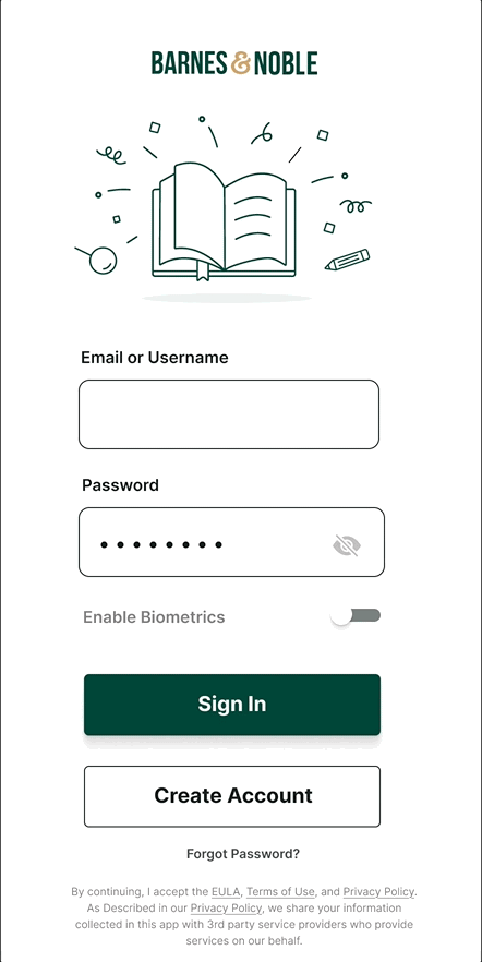
OLD DESIGN
NEW DESIGN

Insights
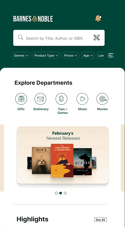
Problem 2
BROWSE BOOK GENRES
-
No way to enable an actual keyword search or filter based on key words.
-
Misleading bar-code icon
-
2 Search bars creating confusion for user
Solution 2
FILTERS AND CLEARER NAVIGATION
-
Filters placed at top of home-screen for easy access
-
Further key searches within filters to create easier browsing based on categories of choosing
-
Bar code icon redesigned to look more reocgnizable
.png)

OLD DESIGN
NEW DESIGN
Problem 3
MY LIST
-
Lack of personalization for the User's list such as recognizable photos or chronological ordering of favorites, etc.
-
No filter feature/search feature to find specific list, (such as alphabetical order or type)
-
Lock icon misleads users to believe their list is private, however, actual meaning means their list is public
making list public
-
No way to share lists
-
High click count to be able to reach setting that allows you turn "public" lists into "private" lists and vise versa
Solution 3
PERSONALIZATION OF LISTS, SIMPLIFIED SEARCHES, AND ACCESSIBLE LIST MANAGEMENT
-
Search Bar to help in navigation for finding lists
-
Filter Icon to allow Users to filter their lists based on key search types
-
Icon/photo association for lists to make finding them easier
-
Sub-tabs under each list to make management easier (deleting, changing private or public list, and sharing)
.png)

OLD DESIGN
NEW DESIGN
Problem 4
MINIMAL PROMOTIONALS, BOOK SUGGESTIONS, & DEALS
-
2 Search bars creating confusion for user
-
Limited Book promotion lists such as book highlights, new releases, etc.
-
Inaccessible location of other services that Barnes & Noble has
Solution 4
CLEARER HIERARCHY OF PROMOTIONS AND SERVICES
-
Additional services placed at the top for easy access
-
Categorized Promotional sections (highlights, New Releases, etc) and provided sectioned sub-categories (best-sellers, Coming soon, etc)

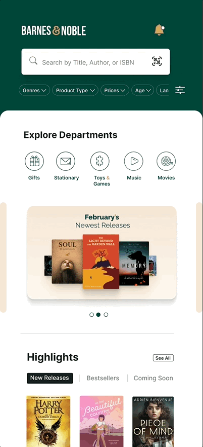
OLD DESIGN
NEW DESIGN
Process
User Research
WHAT ARE USERS SAYING ABOUT THE BARNES & NOBLE APP?
I looked at over 1,400+ app reviews from the Barnes & Noble's app store to see what's frustrating users. Here's what was found:
-
Slow Load Times: The app often takes too long to load or crashes, making people give up and sometimes stop using Barnes & Noble altogether.
-
Finding Books is difficult: Searching isn't great, and the results are messy, making it difficult for users to discover new books.
-
Unclear Navigation: Users mentioned issues of finding certain features such as the other departments (toys, music, etc), or having to dig through unexpected sections for what they need..
-
Missing Key Features: The app is missing important things users expect, like deals and the ability to buy digital books directly in the app.
Information Architecture
REDEFINING THE STRUCTURE
After Taking the feedback from users, I took note of the particular areas of user frustration or areas that may have required the user to dig through multiple layers before finding what they need.
.png)
Original Information Architecture structure of the app before redesign

An Updated version of the Information Architecture
Prototyping
MID-FIDELITY WIREFRAMES
While designing the wireframes, I chose to focus on making the overall design clean and feel more open with the use of negative space. Additionally, I used small mono-lined sketches ( a play on fine-pen sketches & writing) to give a sense of playful contrast to the minimalistic design.

Wireframes: Layout to determine design hierarchy and placement

High-Fidelity Wireframes | Coupons, Cart, & Payment Method

High-Fidelity Wireframes | Loading Screen, Profile, My List